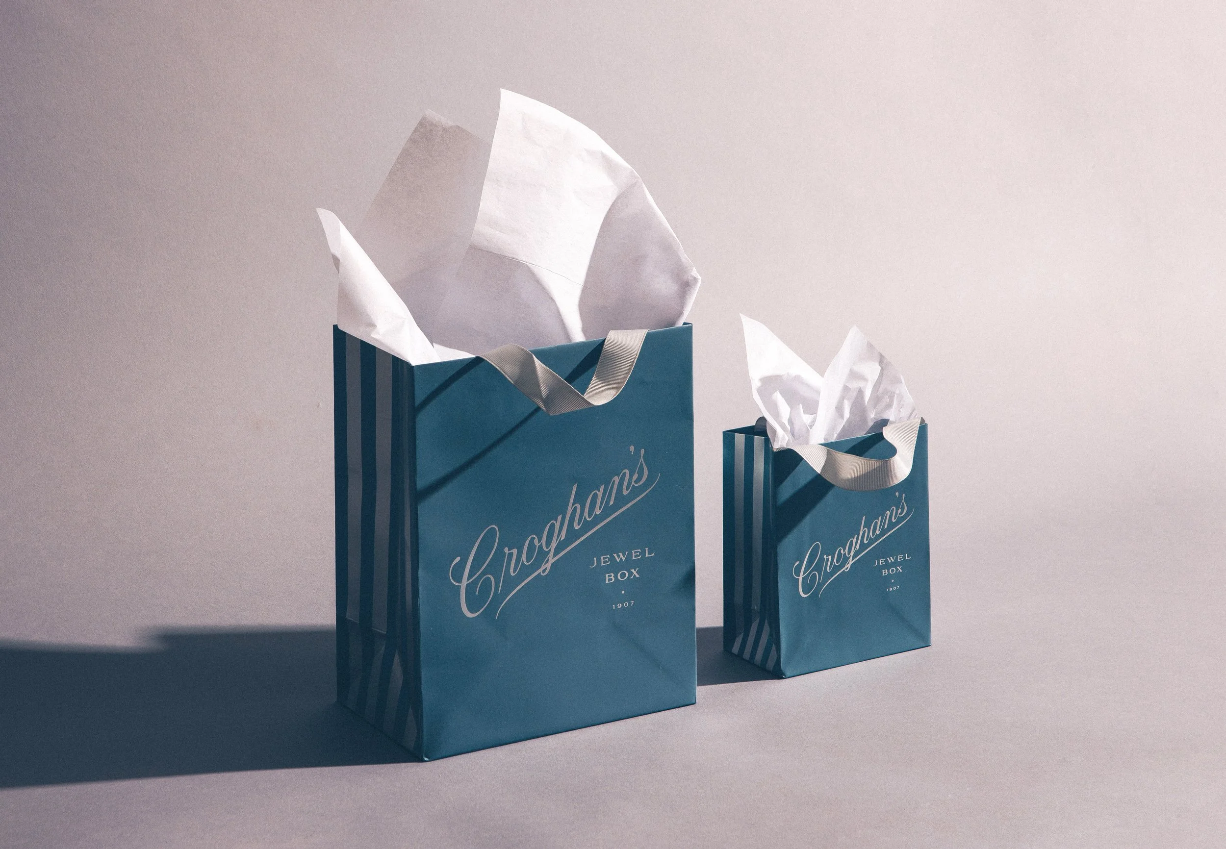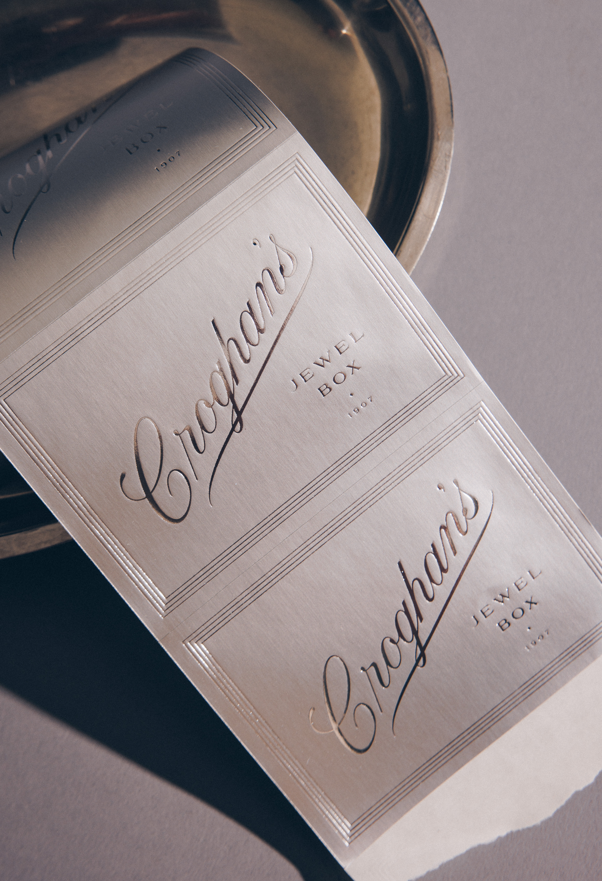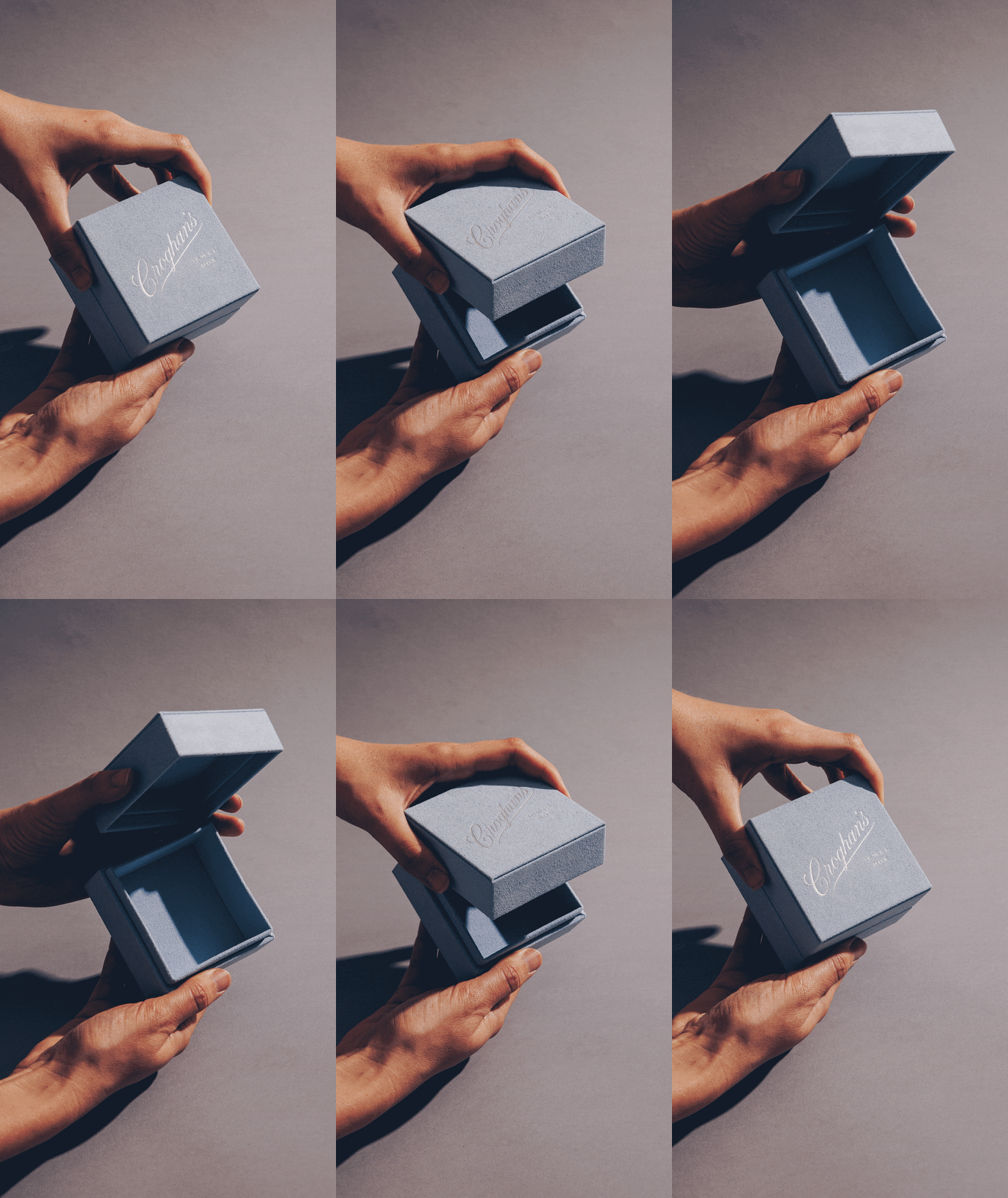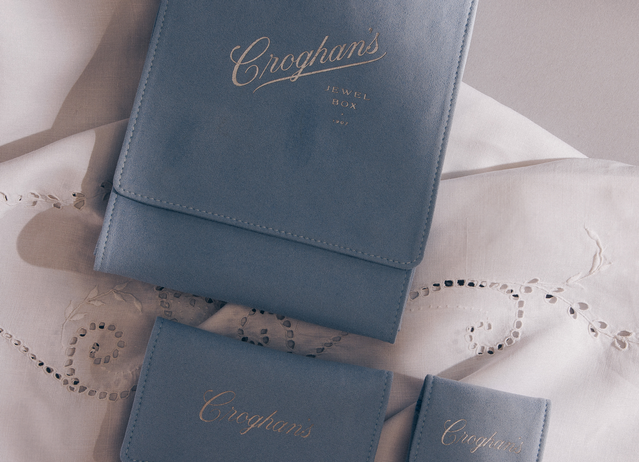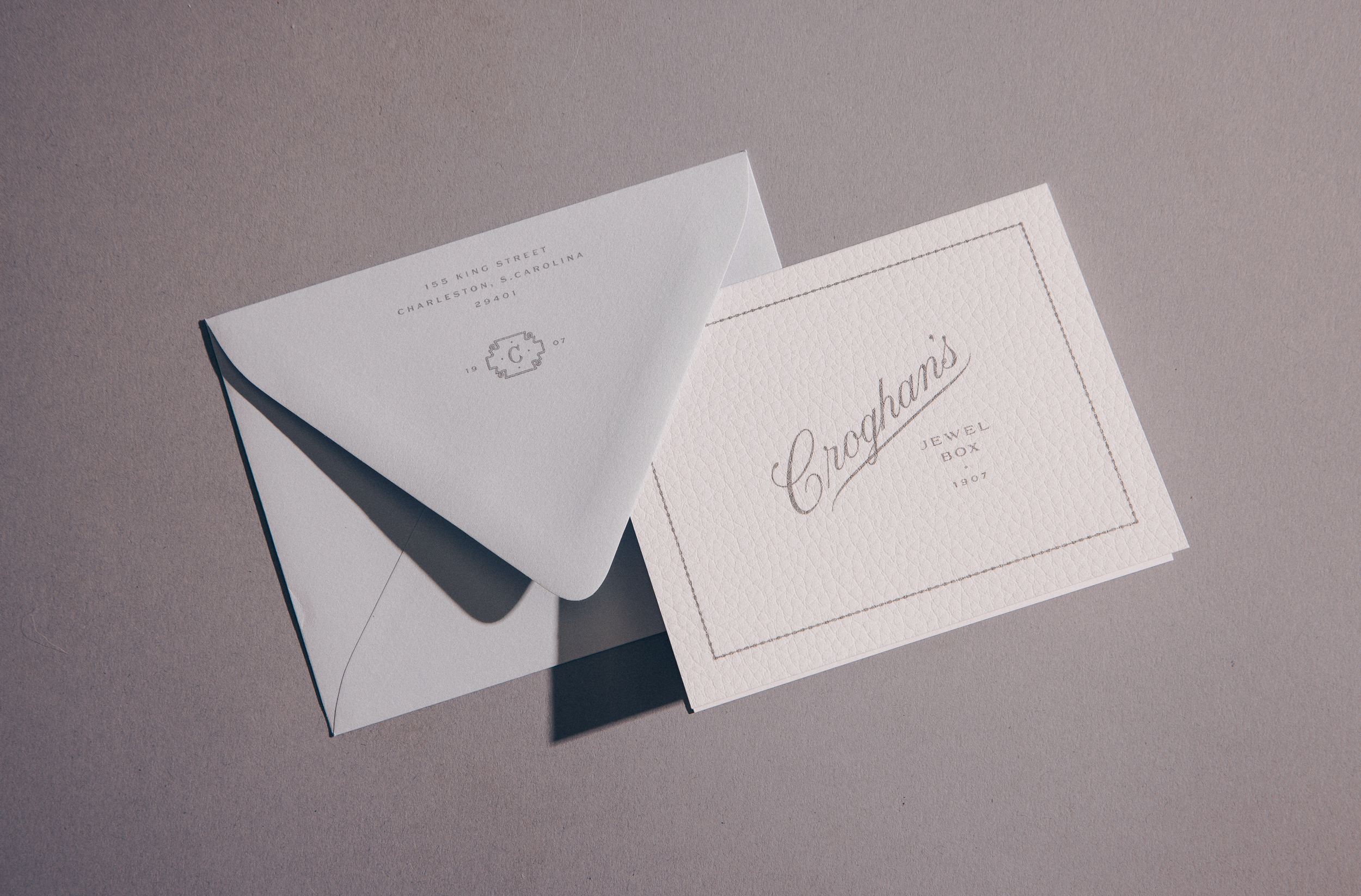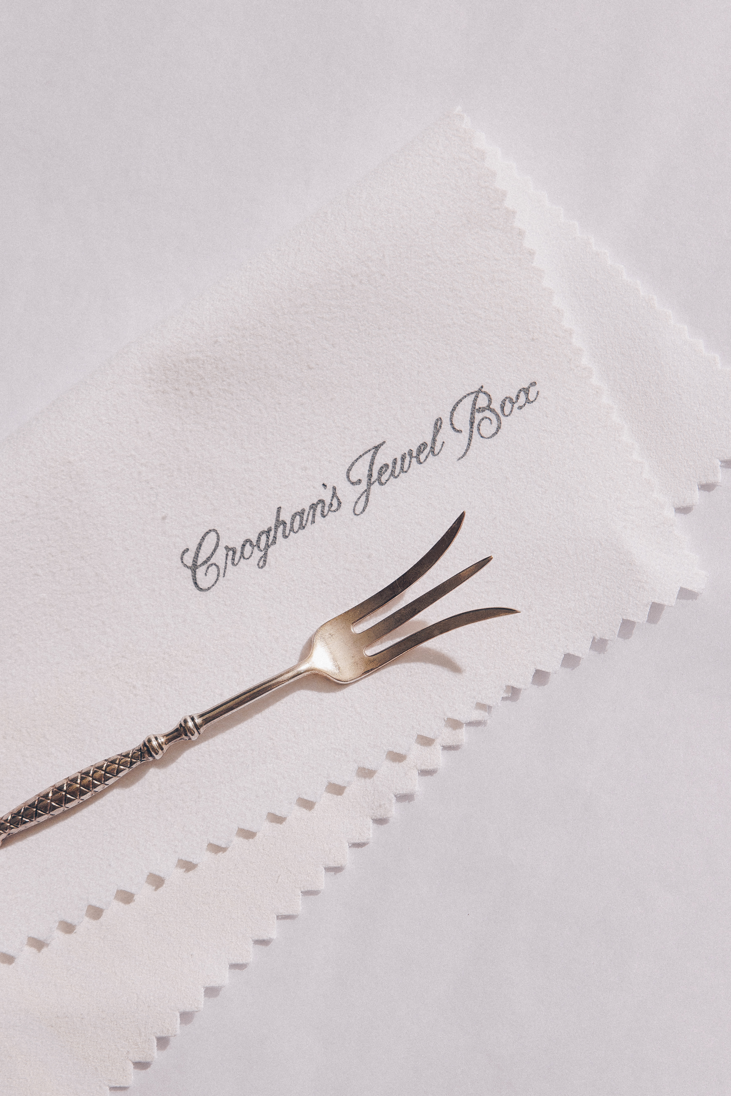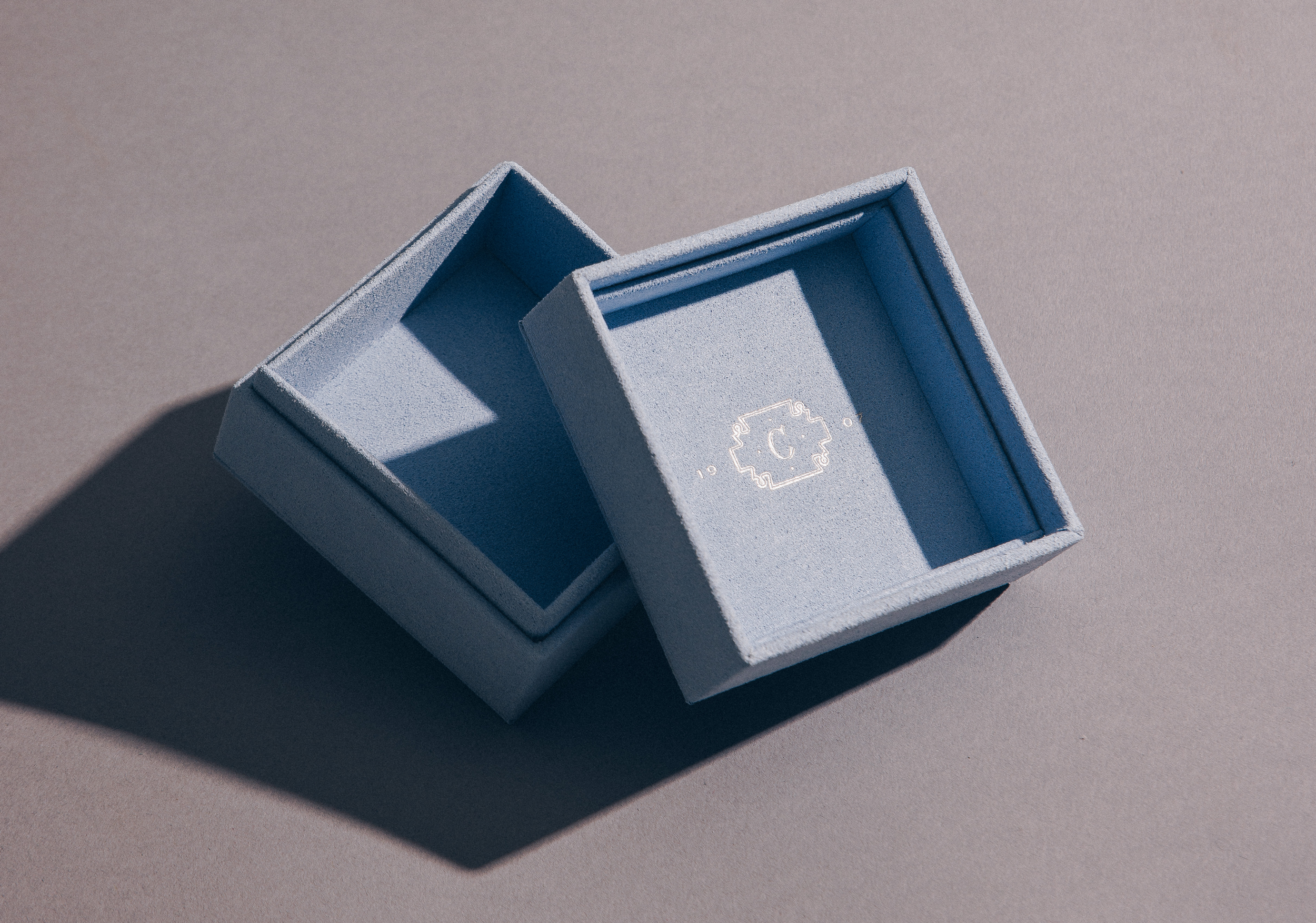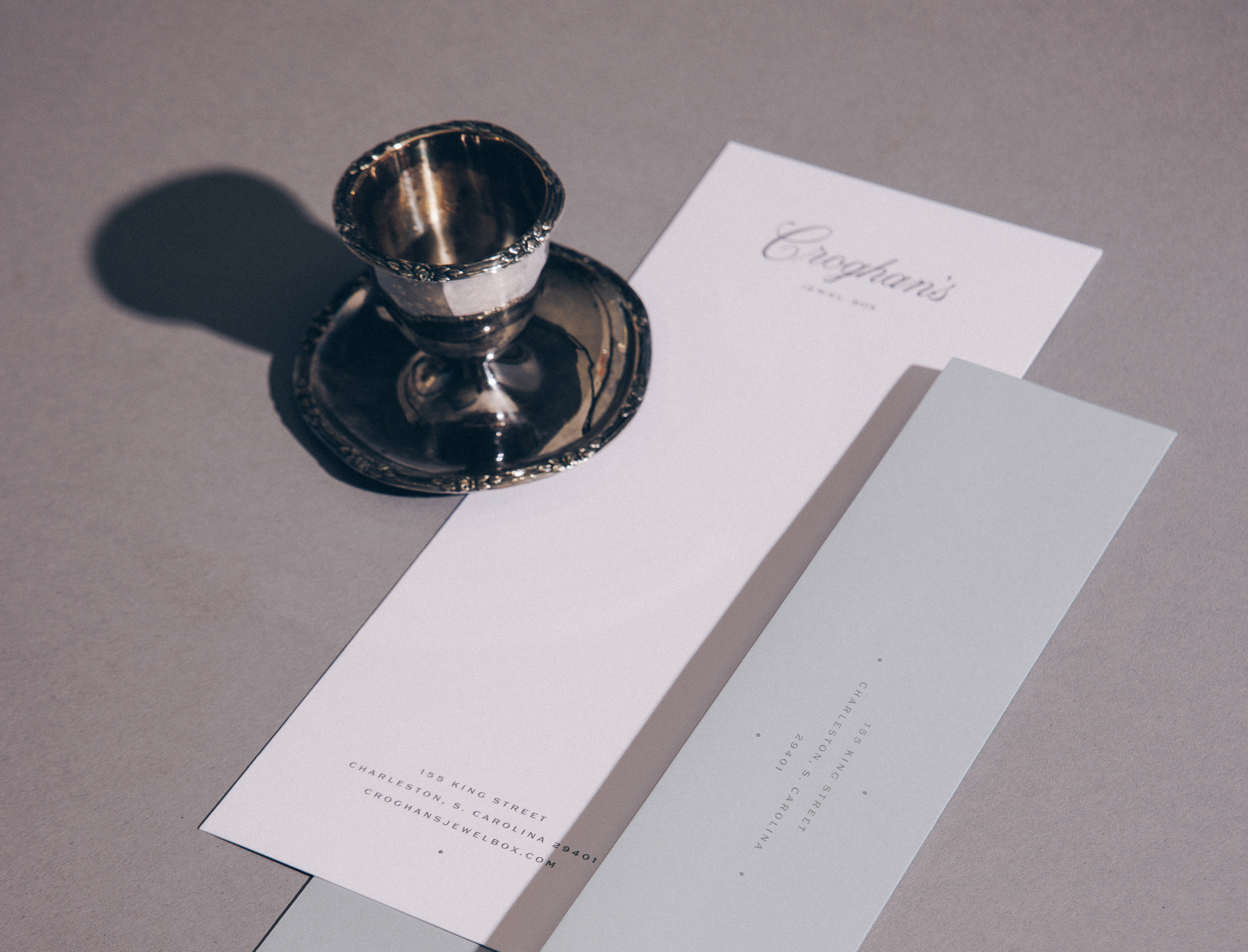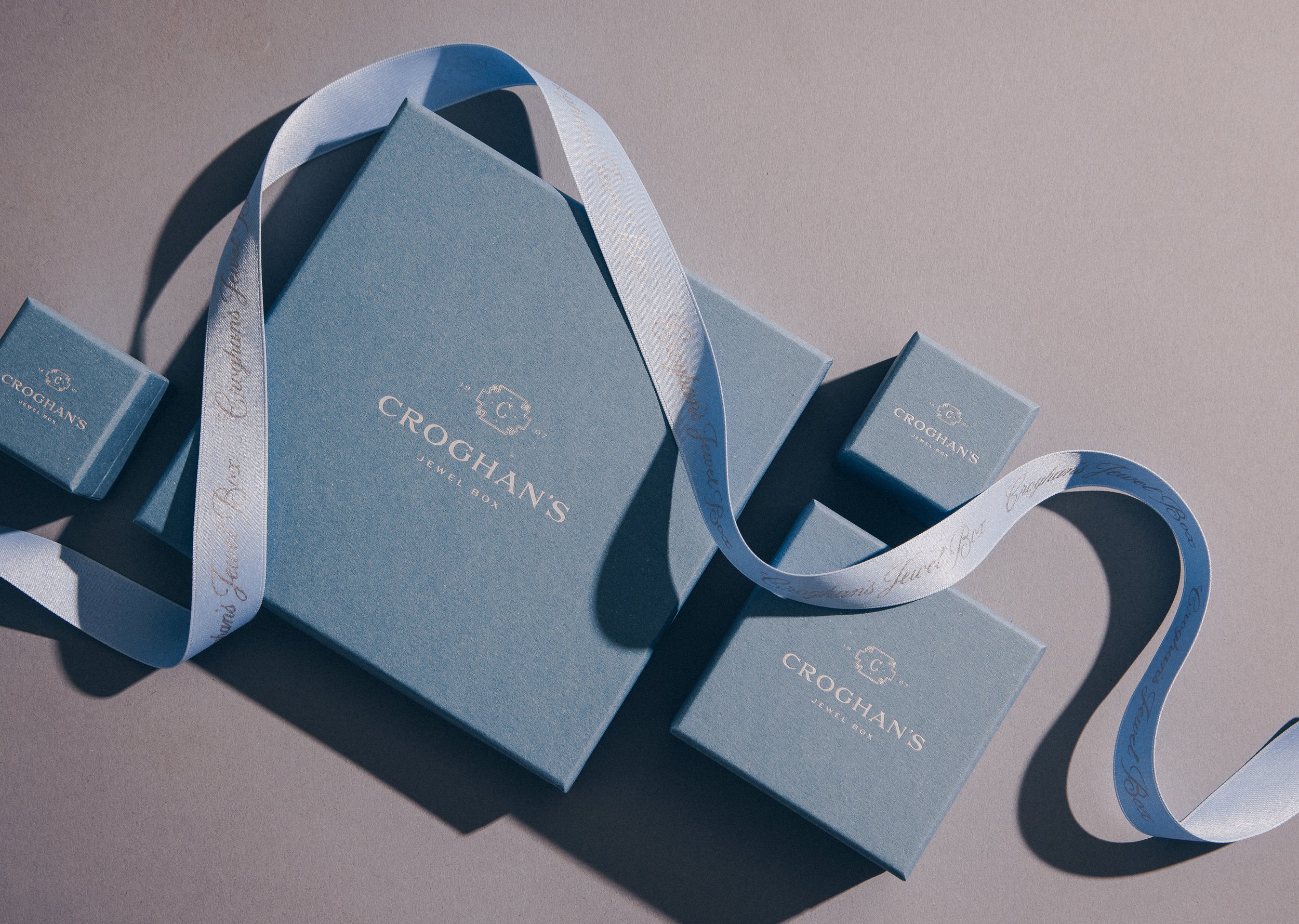


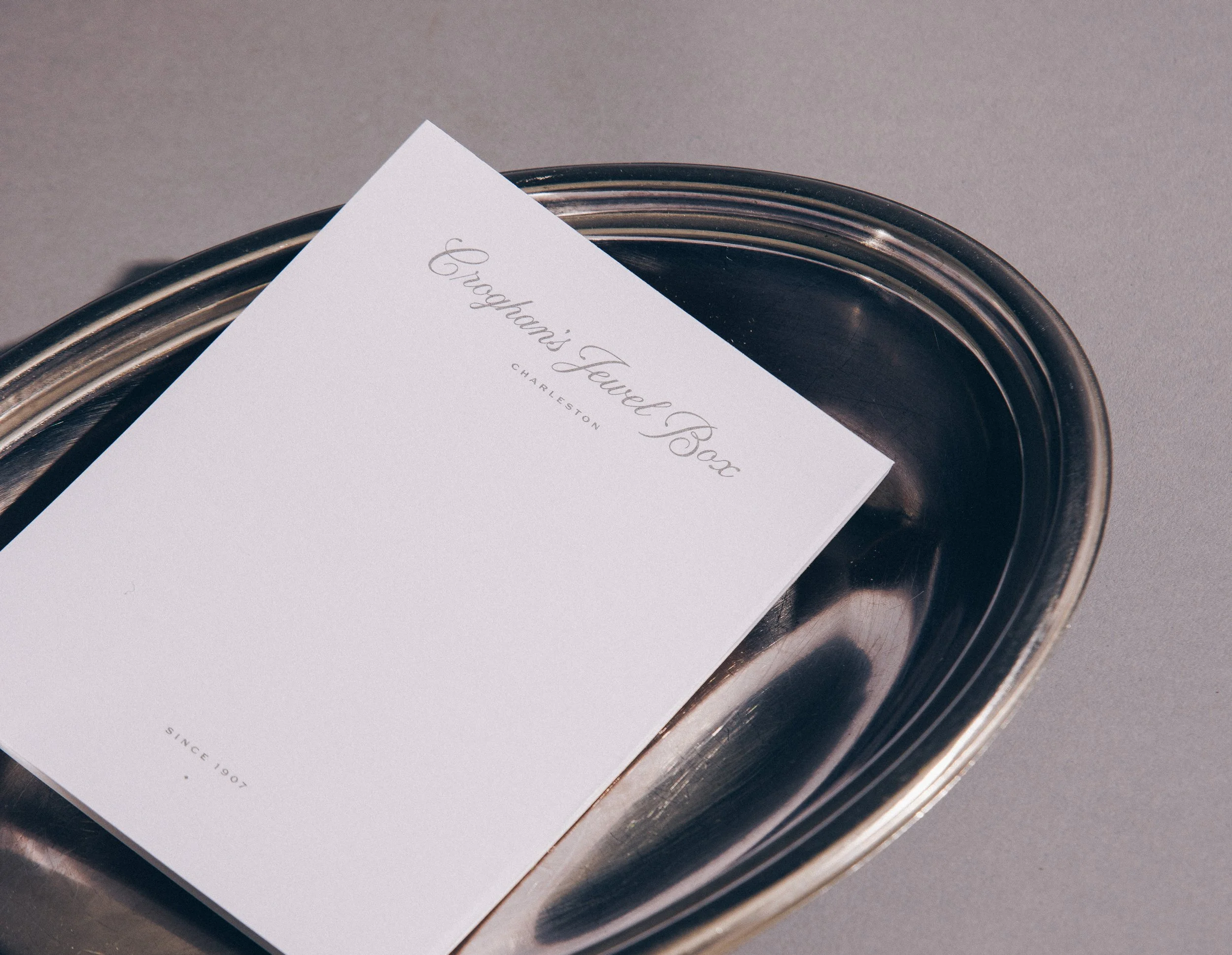
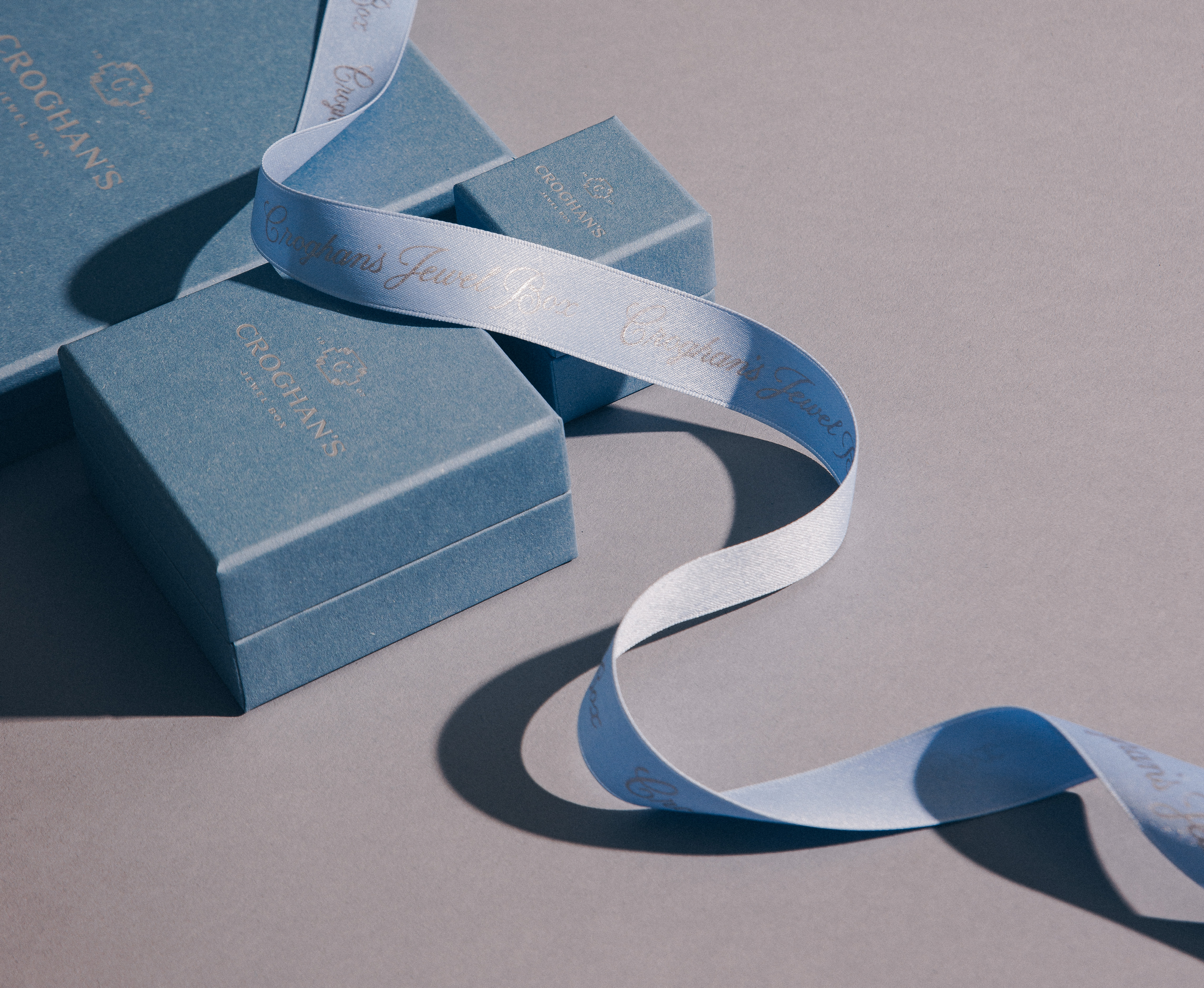
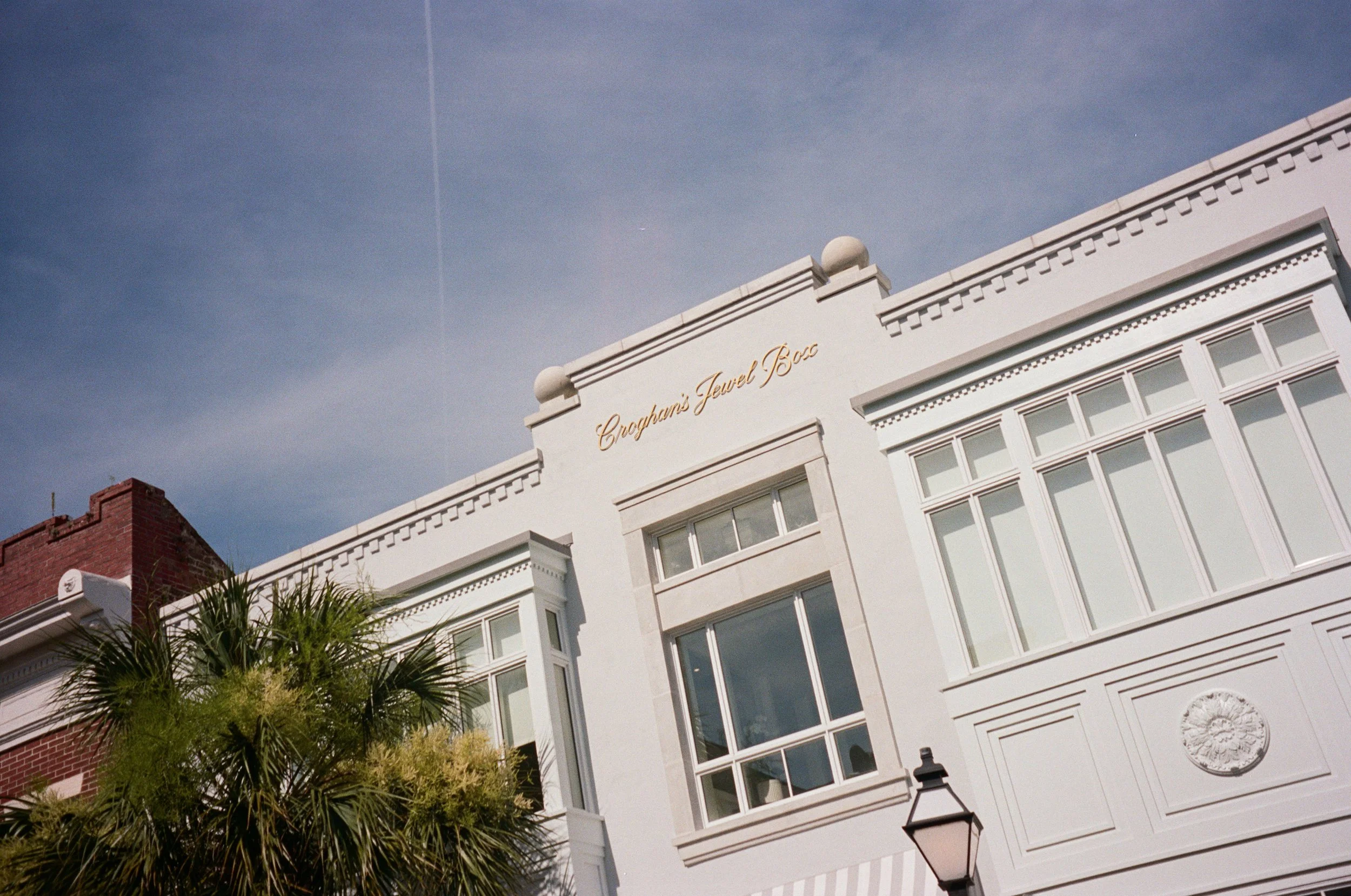
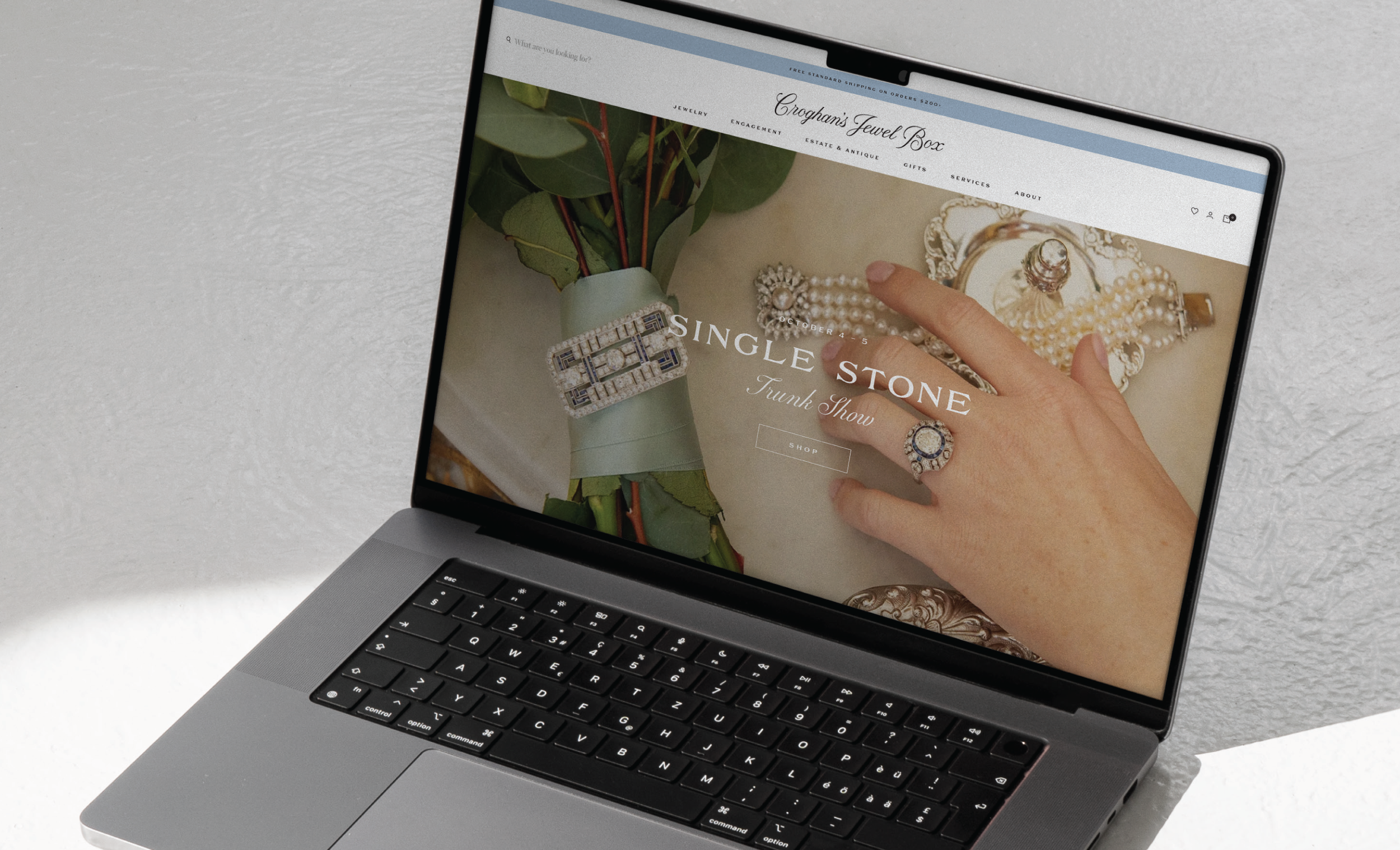
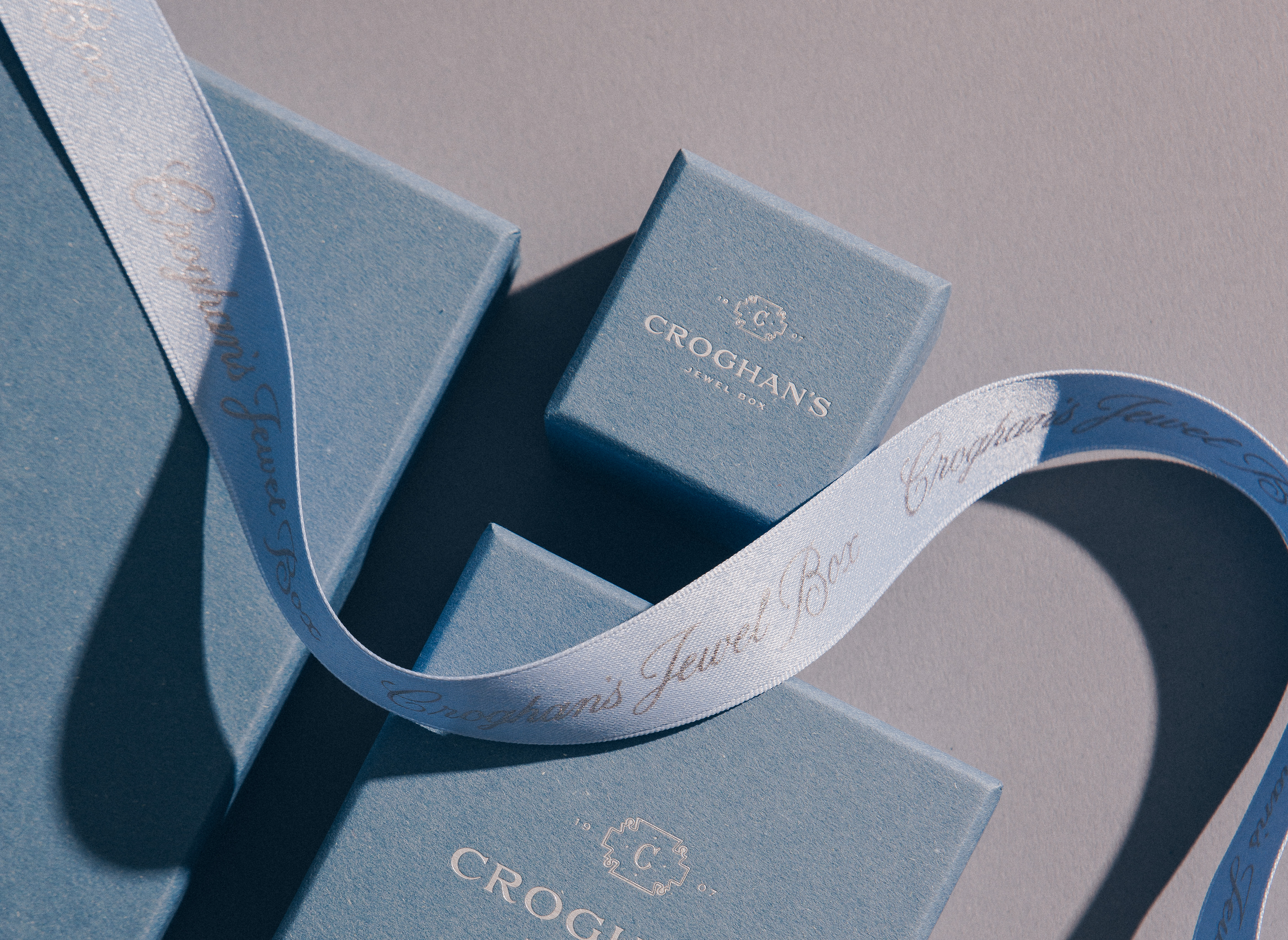
A new brand for an institution: a 100-year old jewelry store in Charleston, S.C. We dug through their extensive archive of historic silver engravings, estate antiques and historic photographs for inspiration, preserving the store’s legacy throughout the brand. The result: a custom script logotype that feels rooted in their story but with modern touches, legible on both a storefront and extra-small ring boxes.
Branding / Packaging / Signage / Stationery
Croghan’s Jewel Box
Photos by Ben Jack
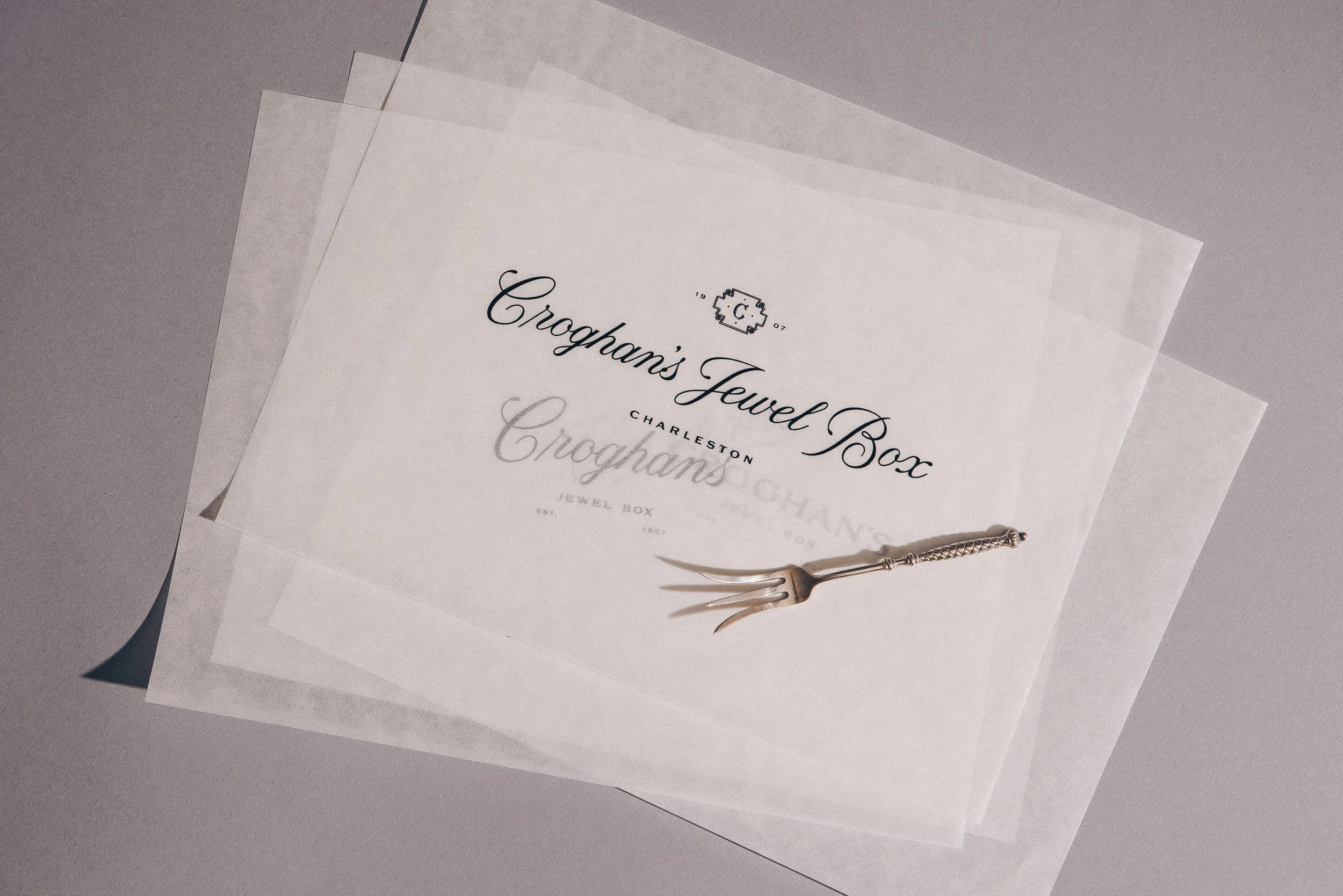
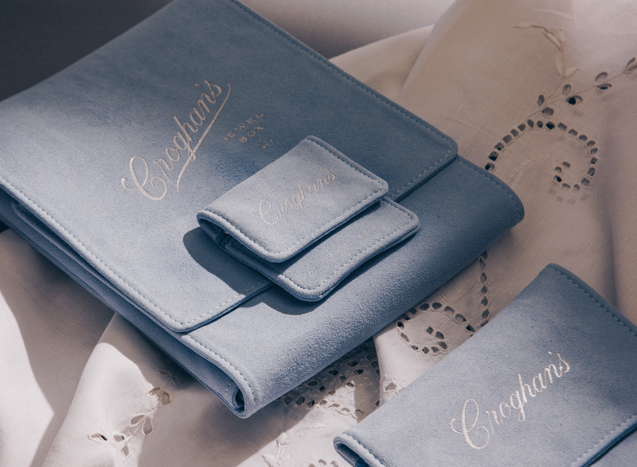
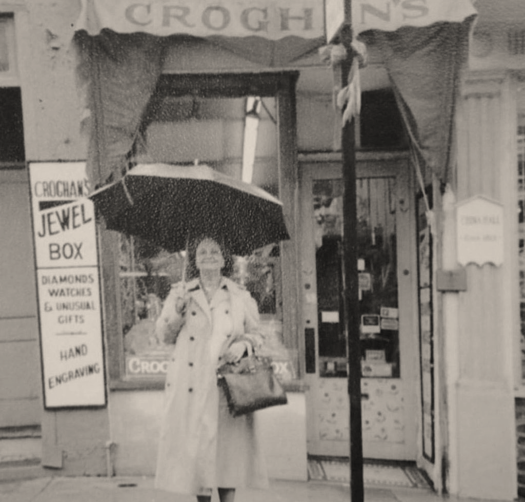
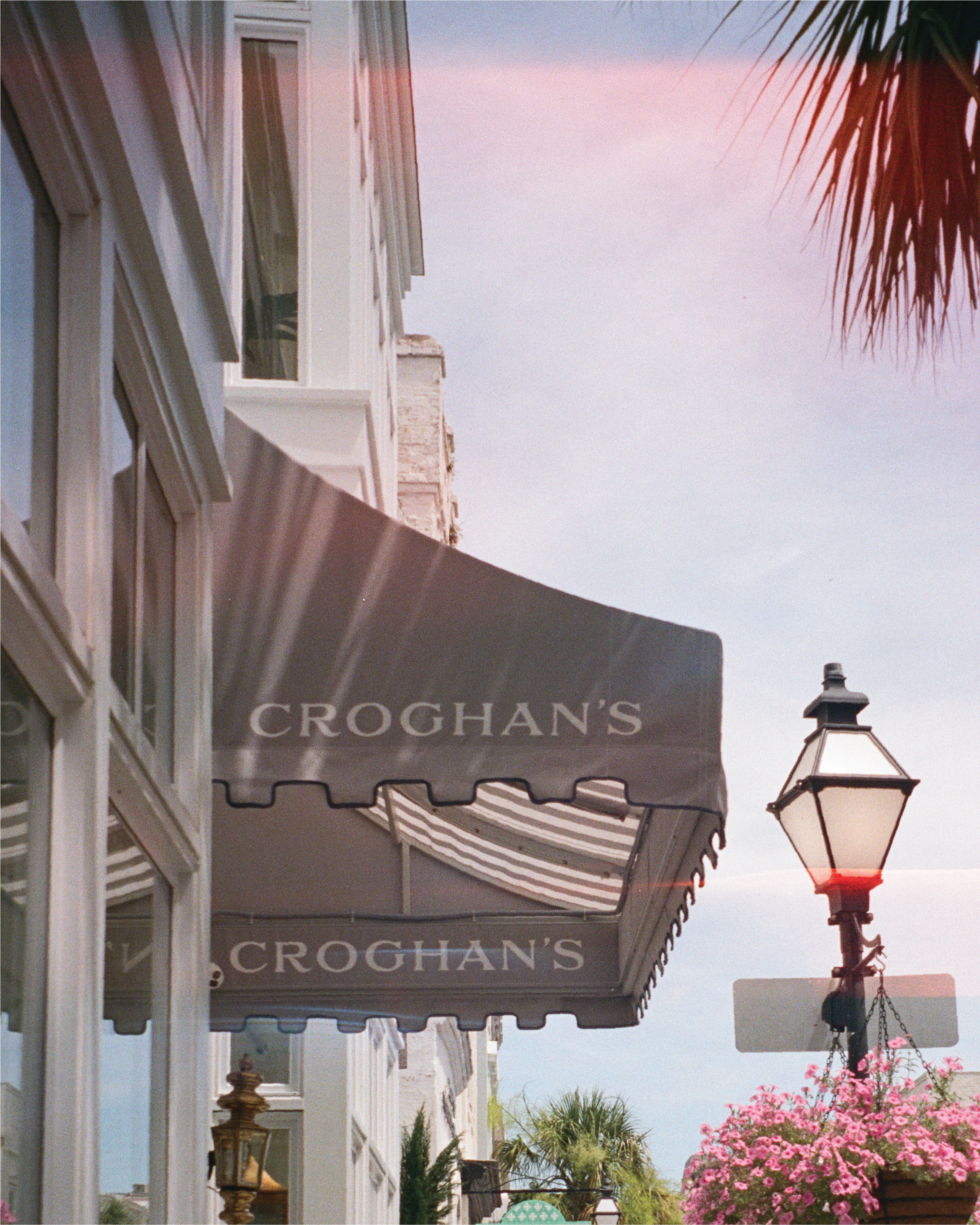
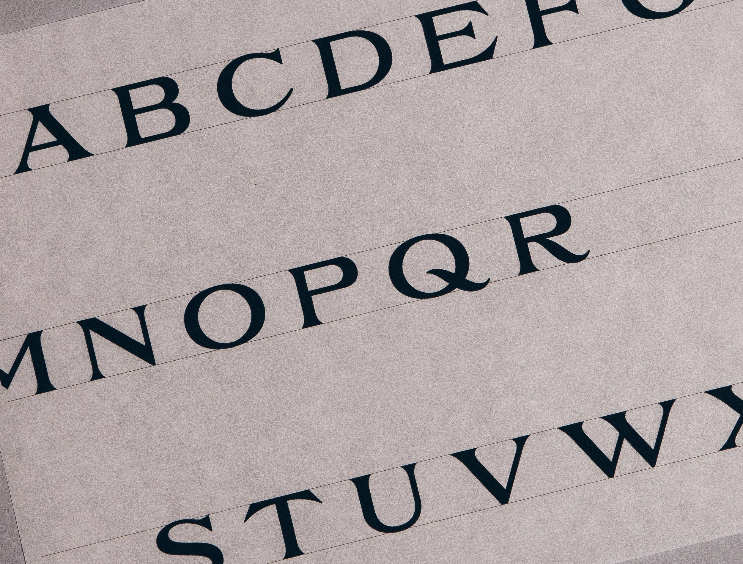
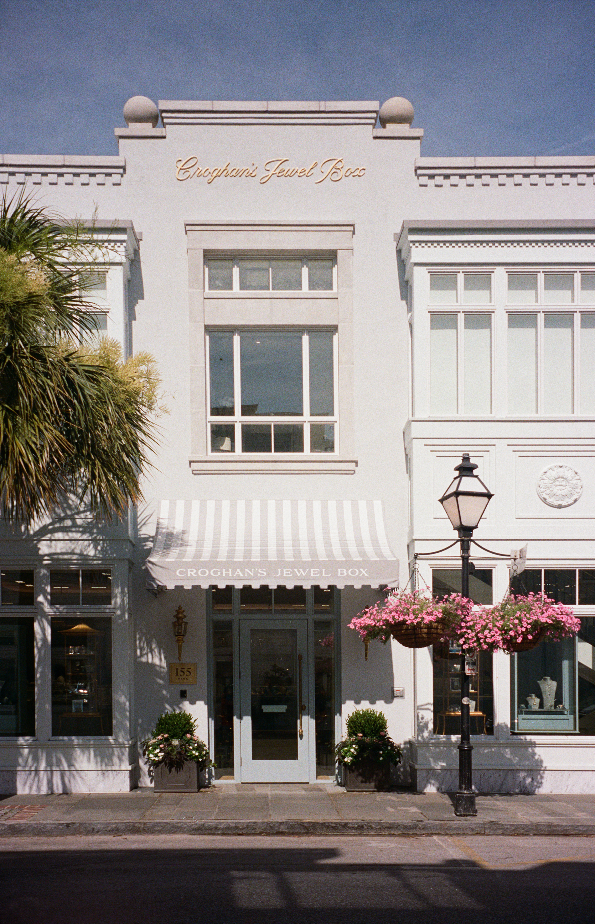
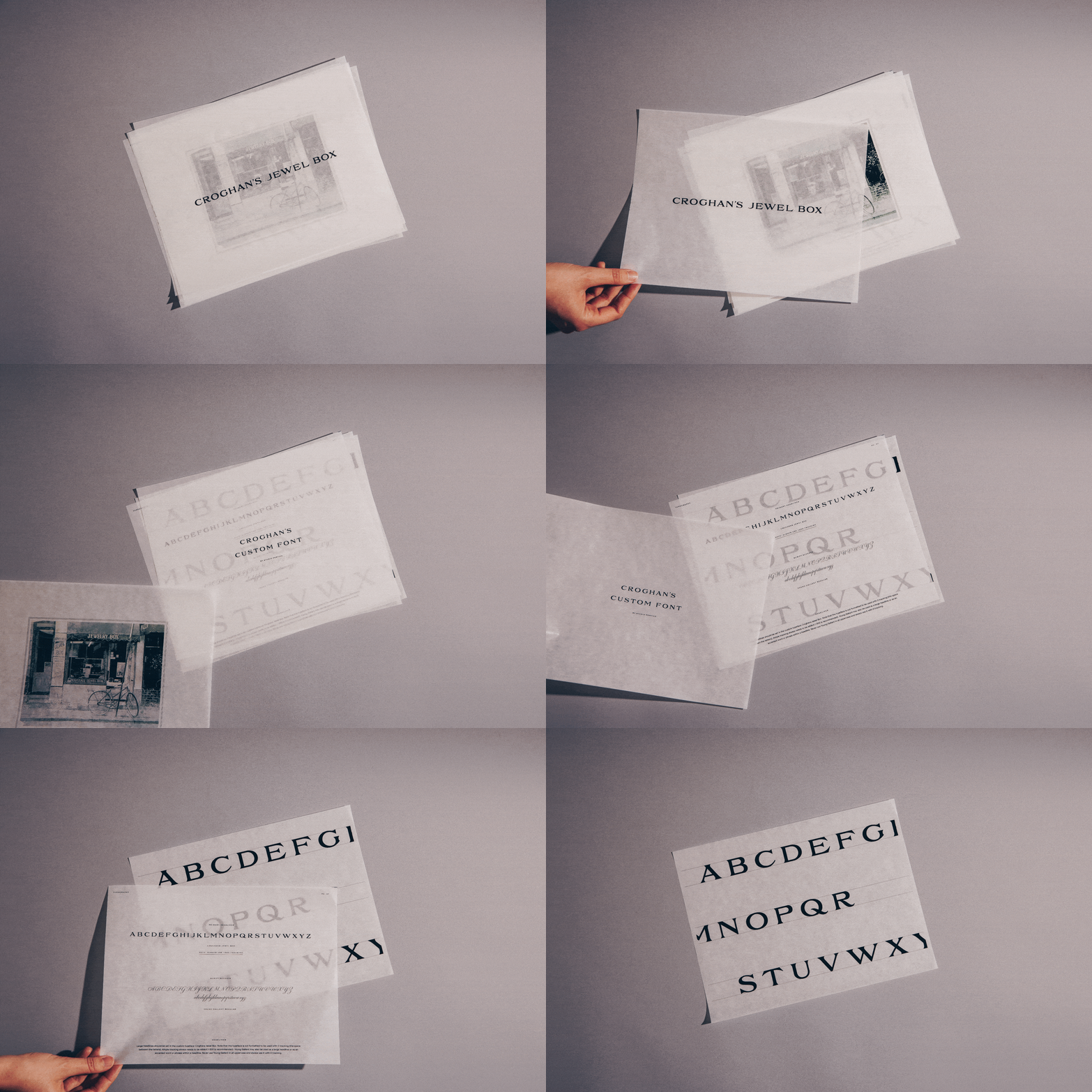
We created a custom serif typeface inspired by the store’s old awning sign. It serves as both a secondary logotype for the brand (for instances when a script is too complex) as well as a headline typeface for all of their digital and print materials.
A full circle moment: it also appears on the store’s new awning.
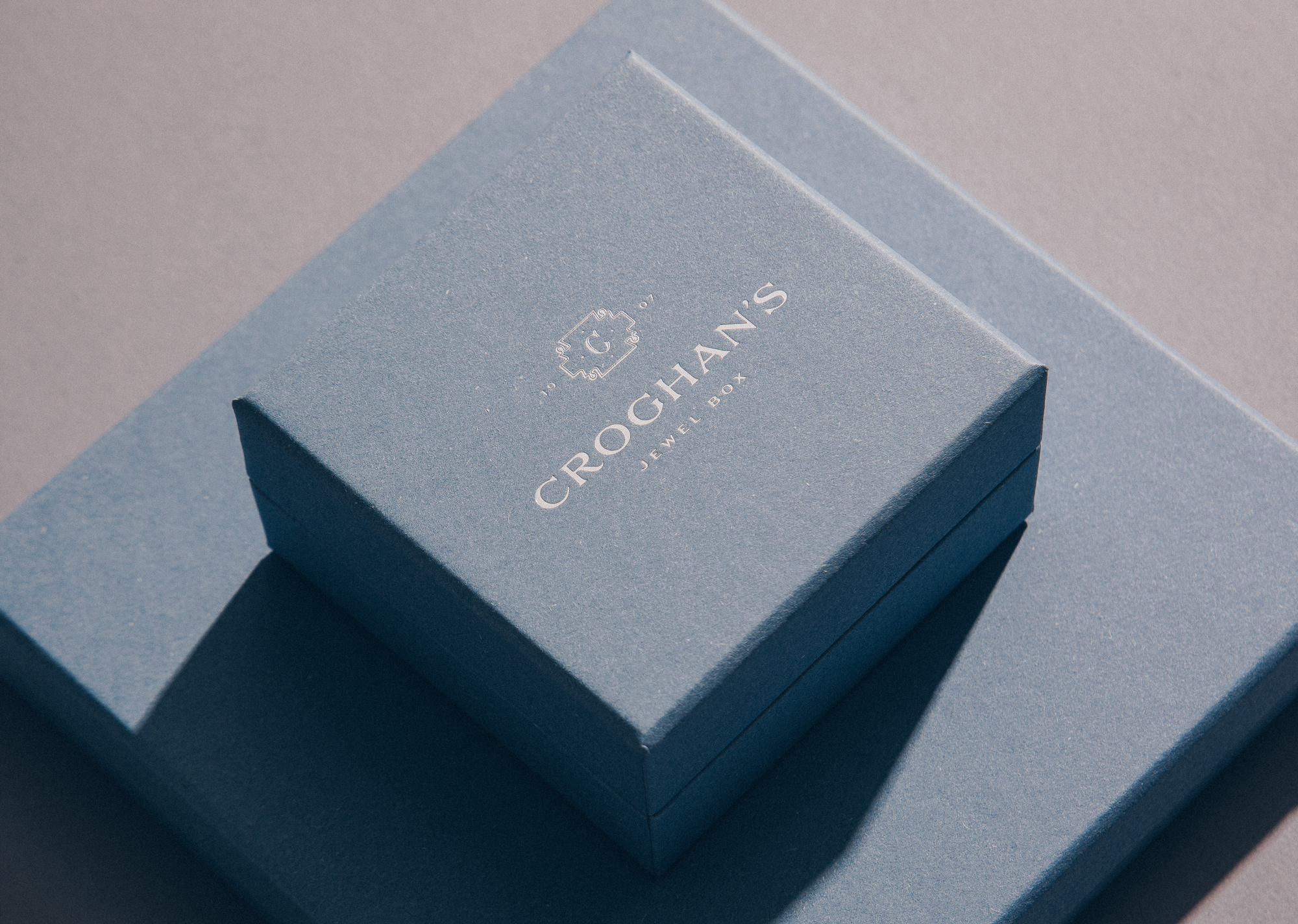
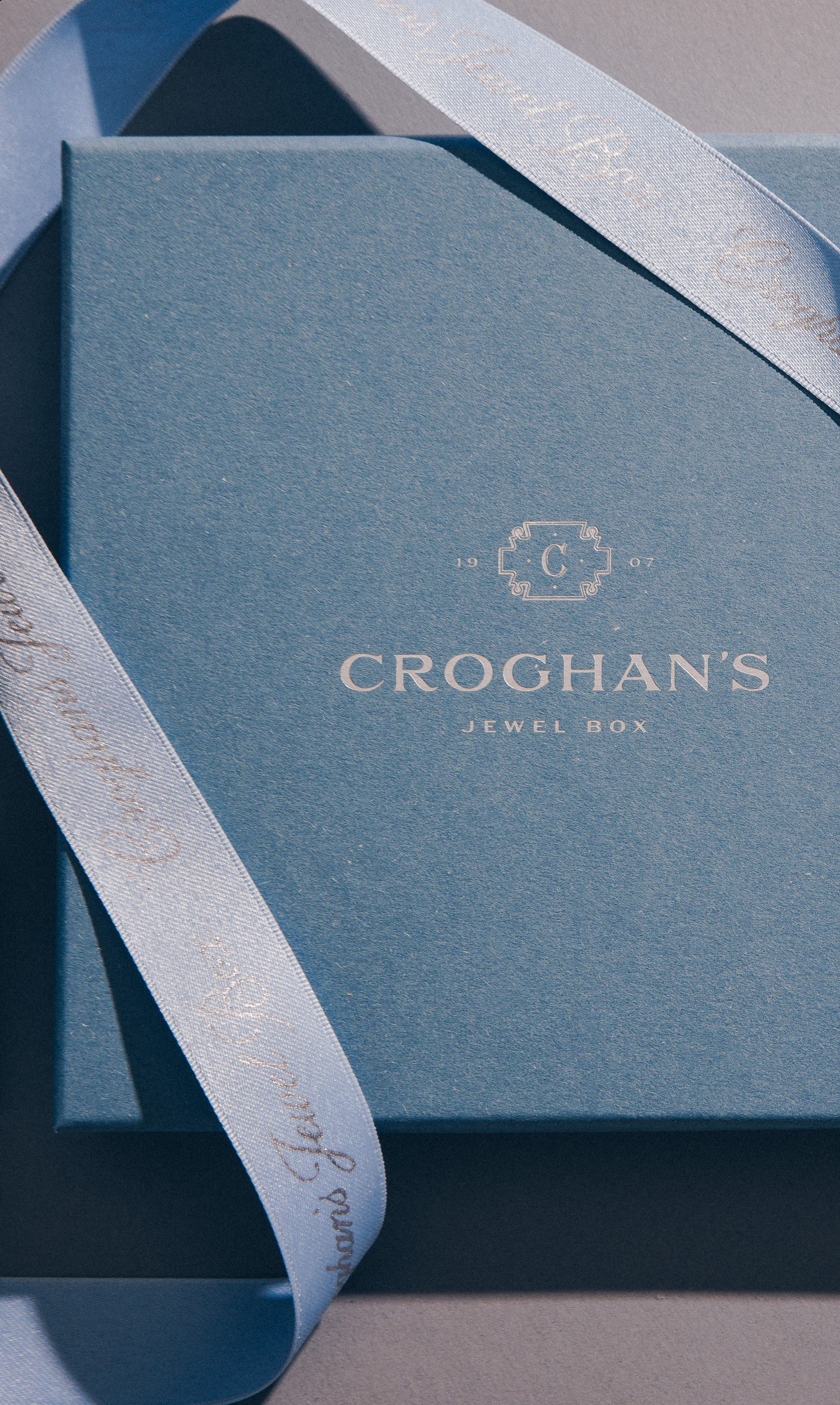
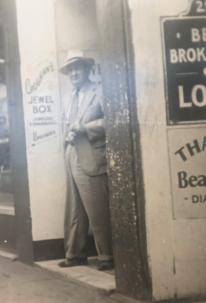
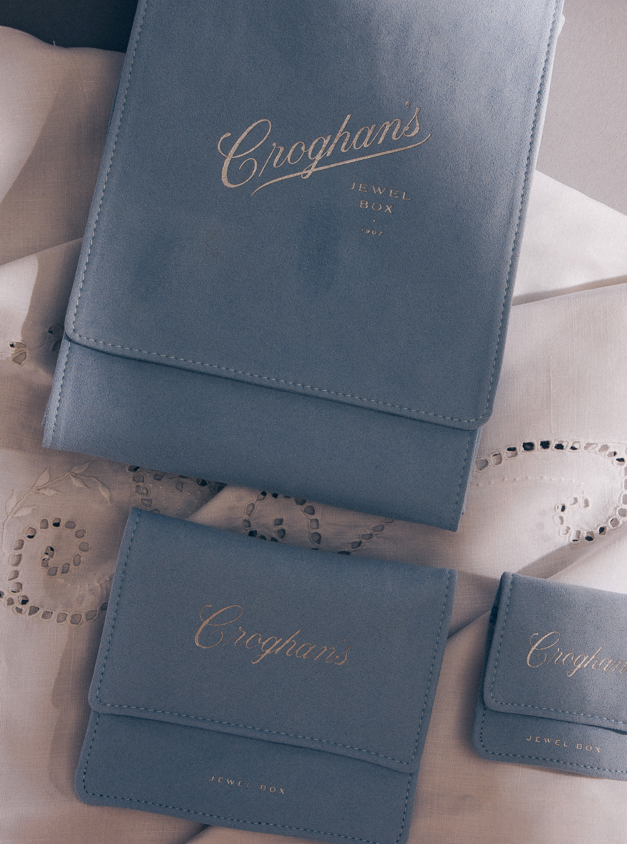
A history-inspired lockup subtly references one of the original painted wall signs (shown on the left next to the founder of Croghan’s). The upward angle referenced the stairs customers climbed to enter the original shop.